On 21 October Apple Music showed its first new identity since the service launched in 2015. The interesting part is not the new icon. It is how the mark was made. The producer Fred again.. and the sound studio NEST Acoustics wrote a short composition, split it into single notes and sent each note through a shallow bath of mineral oil, with cut-outs of the logo underneath. The ripples bent the letters, and the whole thing was captured in camera. According to Cult of Mac, the same composition now serves as the brand's sonic signature, and the moving version of the logo will open Apple Music's videos and concert footage.
A week earlier, the static part of the same rebrand had a rougher landing. When the new black-and-white app icon turned up in a beta, Engadget collected reactions on X ranging from shrugs to "the worst logo change of all time". As a small flat square on a home screen, the mark looked thin. In motion, with its sound, it made sense.
A brand is judged where it lives
That gap is the real lesson, and it is not only Apple's. When McLaren unveiled its new wordmark in September, much of the debate circled around a still image of the logo. Writing in Creative Boom, the brand's former global head of brand, Tom Foulkes, argued that the objections went deeper than the letters: people were asking what the brand was turning into. A logo on its own leaves a lot of room for that kind of reading.
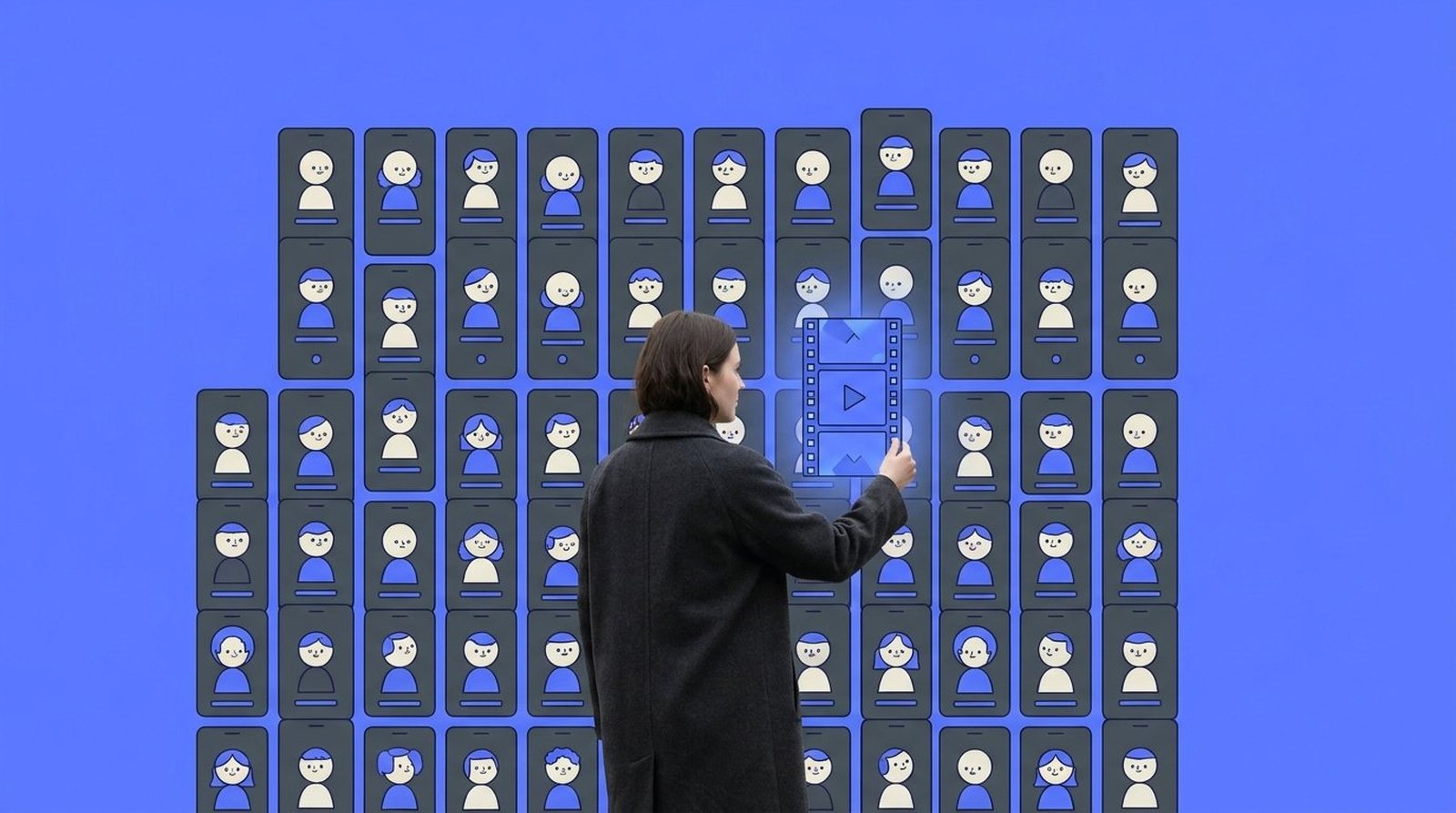
Most people now meet a brand on a screen: in a feed, inside an app, in the first two seconds of a video, in a story that is gone tomorrow. Those places move, and most of them have the sound on. The motion studio BUCK said it plainly in its predictions for this year: static wordmarks are on their way out, and identities will be designed for apps, feeds and interfaces first. You do not have to share the bluntness to recognise the direction.
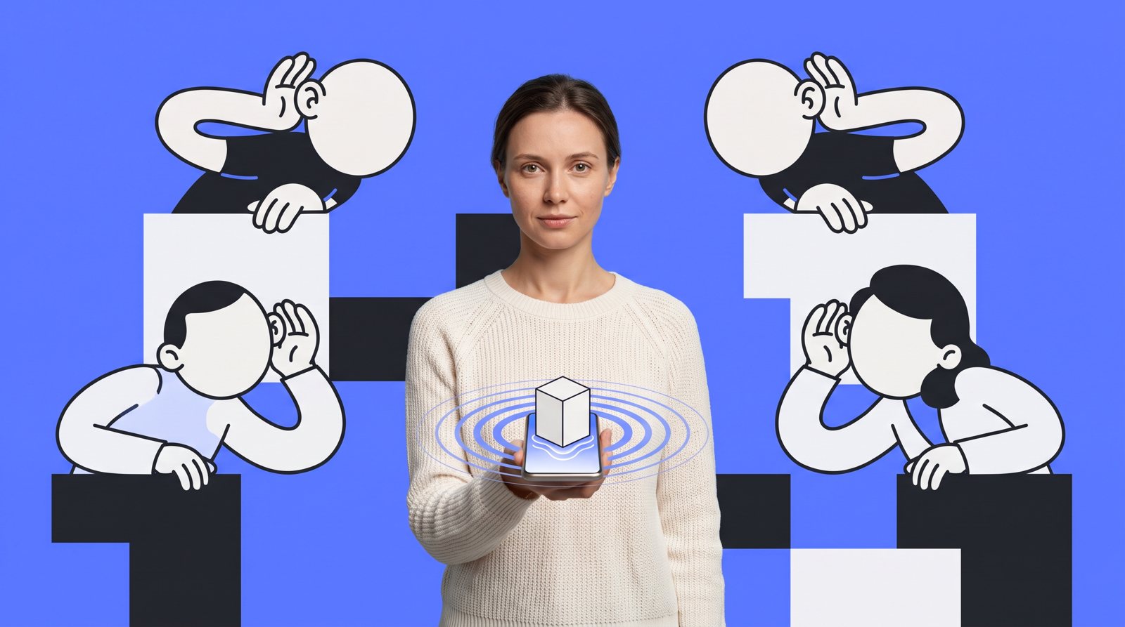
Sound is the half most brands skip. The sound branding agency amp compared more than 150 global brands for its 2026 report. Most of them, 73 percent, use a sonic logo. Yet owned, branded music among the companies it featured fell by 67 percent, while one-off custom tracks rose. In other words, many brands rent a different sound for every campaign and end up sounding like nobody in particular.
What starting now looks like
None of this needs an Apple budget. It needs a different order of work. Instead of drawing the logo first and asking someone to animate it later, you decide early how the brand behaves: how it enters a frame, how fast it moves, where it comes to rest, what it sounds like when it appears and when it leaves. Those few rules then carry the whole system, from a six-second pre-roll to an end card, an app loader or a slide in a pitch.
A simple way in is to test your current identity where it actually lives. Put the logo at the end of a vertical video with the sound on. Drop it into a story between two other brands. Look at it at thumbnail size. You quickly see what holds and what goes flat. Often the answer is not a rebrand at all, but a layer of motion and sound on top of what you already have.
It makes the rest calmer too. A team with clear motion rules does not have to reopen the discussion for every new video, because the brand already knows how it moves. And a short sonic signature that you own works in every format, from a podcast spot to a screen at a trade fair.
Where we fit in
We come from film, so we tend to think of a brand as something with timing, rhythm and sound, not only a shape. That is why we treat branding and motion as one job. Apple's oil bath is a lovely piece of craft, but the idea underneath it is simple and open to any brand: make the identity for the screen it will be seen on.
If you are curious how your brand moves and sounds today, we are happy to take a look with you.